Friday, September 23, 2011

5 Dragon Daughter

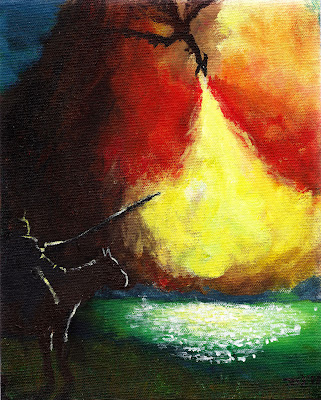
I was pumped when Matt Black asked me to contribute a painting to the next performance of 5 Dragon Daughter. I was also really nervous. The show, if you haven't seen it, is a huge multimedia production, live music breaking the story up into "chapters" while over 400 illustrations, dancers, puppets and during the intermission, paintings like the one below.


After two false starts (and one dead end in the middle of the process), I finished up about an hour before the deadline. I ultimately just had to pray for a vision because nothing I had was even remotely working. After I did, this started to expanded naturally onto the canvas. No preliminary drawings, nothing intentionally planned (the soliders/battlefield at the bottom was an 11th hour addition). I'm really thankful God gave me something for this weekend.

If you haven't seen 5 Dragon Daughter, I strongly encourage you to do so. Belcher Center in January, tonight at Crossroads Church, plus whatever shows they manage to squeeze in between then and now. It's incredibly humbling to see God move through so many people so mightily.

Monday, August 1, 2011

With Apologies to Joseph Mallord William Turner

Here's a little (8x9.5 in) painting I did for a good friend of mine, saying "thanks" for letting me crash at his apartment in LA. I had just an amazing time with him and his wife. Acrylics with no real direction before the brush touched the canvas.


We played a lot of Warhammer in highschool.

Thursday, July 21, 2011

Drawing Batman

New sketchbook. New pen. Drawn while watching Batman Begins.

Monday, April 25, 2011

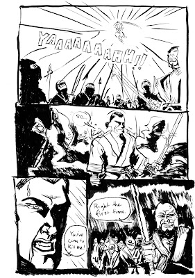
A One Page Comic

Thursday night I spent 30-seconds-to-a-minute thumbnailing and went immediately to inks; this is what I got.


I dig this. If I can get my new scanner/printer to print blue-line pencil roughs (ala Sean Phillips), I'm gonna try doing a whole comic that way.

Thursday, March 24, 2011

I need YOUR opinion

Hey Guys,

Sooo, Brian Azzarello needs someone to draw his t-shirt and I want that to be me.

Let me backup.

Threadless is having a "Noir" competition. Design a NOIR t-shirt, get it picked, make money, comics and a chance to work with a writer who I really respect/admire (to design aNOTHER t-shirt).

I sketched out a bunch of rough designed and picked out the best three to show to you - I need YOU to pick your favorite (and if you're feeling generous, pick a 2nd favorite). If you want to get crazy with it and leave some feedback (different colors, change the placement, figure A doesn't read, etc. etc.), that'd be amazing too.

So comment here or on facebook or twitter (@ottobott), or use this handy dandy poll I set up (https://fnnl.it/wk ). Thanks for your time and feedback!

Without further adieu...

Design A - Smoking Gun
Pretty straight-forward. The detective guy's just fired his golem and int he smoke, we see the fat-cat ganster he punctured and the dame he was with. This was one of the first ideas I had outta the gate. It might be a bit too crowded though.


Design B - On the Waterfront
Probably my favorite of the three. City at night, lights reflecting on the water. In the fully-rendered version, the water is going to be the focal point, a twisty maze of water (really line-centric and heavily detailed - much more then the rough implies). The white-space body in a dead-man float is subtle, but really what makes it so appealing to me.


Design C - Three's a Crowd
We've got the singer, minding her own business. Thug is watching the dame (and getting angry). The detective (far back) is watching the thug and about to tackle (or shoot) the 2nd guy. I like this because it's every NOIR movie situation I've ever seen distilled to it's most basic elements. Guy wants girl. Girl's afraid of guy. Hero steps in to protect the girl.

Friday, March 18, 2011

3wc - Midget Sarcophagus Blanket


I get to explain why this turned out like this, right?

So basically, my eyes got bigger then my stomach and the dialog I imagined working well on a line-by-line basis read all sorts of crazy when you put them together. I don't think anything is really clear about this, but the three main elements are present, so I think it'll pass as a 3wc.

To spell out the "world" I attempted to create with this challenge, my basic concept was that I've always found Hellboy's villians as being just as interesting as the title character. So much so that I've always been sad to see Mignola kill them off so quickly. That's where I came up with Toht (named after the balding, spectacled Nazi from Raiders of the Lost Arc), who was an evil warrior-king reincarnated a midget. He had been searching the world around for his warrior-queen's remains who he planned to reanimate and then take over the modern world like they had thousands of years ago. The only guy in their way is the cocky American super-spy/hero. I hadn't fleshed much out about him besides he had this Substitution-Harness that switches his body out with whatever was wearing a secondary, linked harness on the point of death. That's why he can't die. The juxtaposition of the hero with decidedly cowardly traits amused me. Again, not at all explained well in the comic.

All in all, kind of a misfire, but I really like some of the ideas demonstrated here. Hopefully I can reuse them more effectively in the near future.

Friday, March 4, 2011

3wc Teaser


I finished up inking my new 3wc entry last night and I'm pretty pleased with the results; it really scratched that itch I had of just needing something I could have fun with and experiment on. Here are the first three panels in an entry that ended up being 3 pages long. Lots of fun to draw, I'm hoping I can get it lettered and colored this weekend (maybe).

Past 3 Word Challenges -> http://the3wc.wordpress.com/

Thursday, February 10, 2011

First Few Tests...

I "finished" the pencils of the first issue of my big comic project, "Small Town Devil." For those of you who don't know, it's a project I've been writing/developing for a little while now and can basically be summed up as The 'Burbs meets The Last Picture Show with some Motörhead thrown in for good measure.

Anyway, when I started penciling the project, I was really inspired by the work I was seeing from Jerome Opena and Travel Foreman. They've been going straight from pencils to colors with really stellar results. As I trucked along in the project, my pencils got looser and looser (with the intention to tighten when I ink), but nothing has been quite as satisfying as those first 10 pages I drew.

Here's a test scan of some of those first pencils, with some loose colors thrown over them. Thoughts?